my homescreen
I’m always interested in seeing other people’s home screens - it’s a simple thing but they can be so varied in execution.
I figured I’d write a bit about mine, particularly since I recently made a significant change. Writing might help me really evaluate if this is working for me.
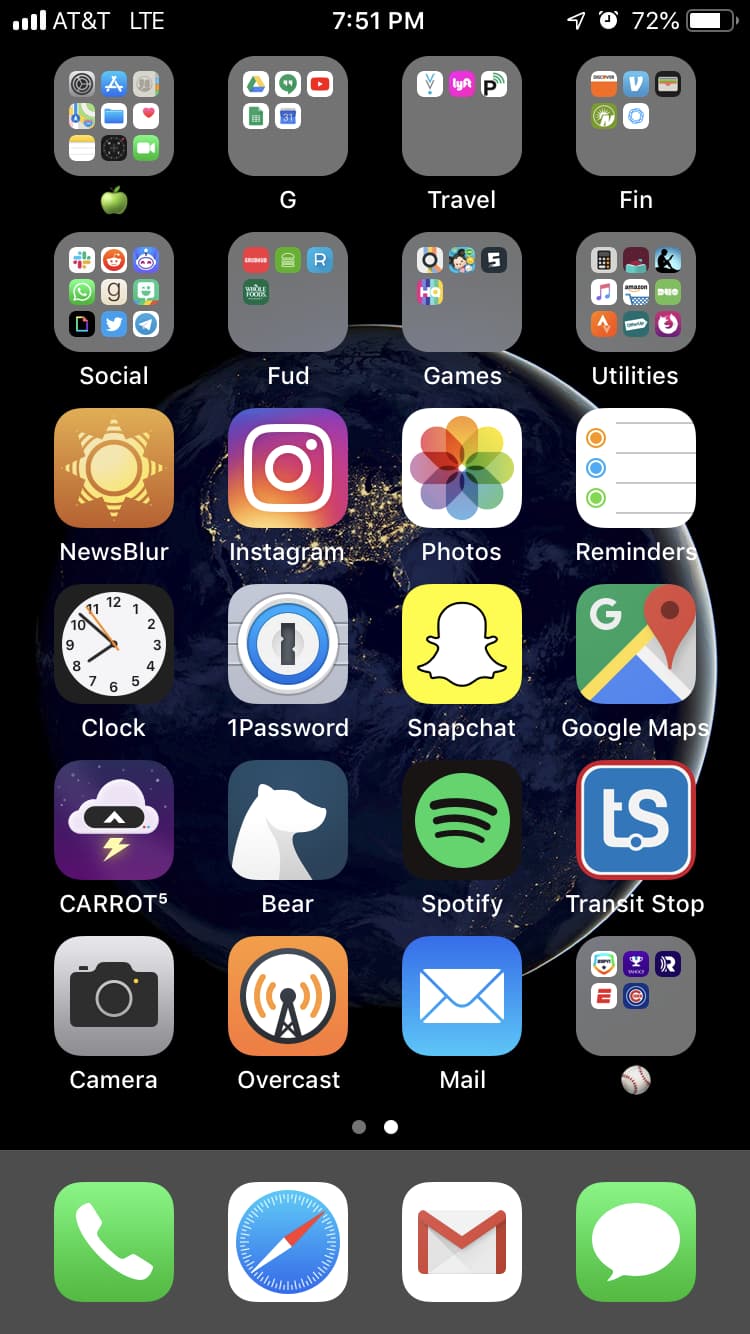
I wanted to simplify things down, and get everything on a singe page. There were a couple of reasons for doing this:
-
Simplicity - no longer having to swipe from page to page. This wasn’t even so much a concern of efficiency as I just didn’t want to do it. New apps went on the second (or third) page and I’d forget about them. You could argue that this is now less simple with apps nested in folders. You wouldn’t be wrong, but for my brain this is simpler.
-
Ergonomics - with more apps on the single page, I could fill it up all the way to the bottom, making it easier to reach my most frequently used apps. Comes in handy when I often use my phone one-handed with my short thumbs.
-
Notifications - I can easily see all my notifications on one screen. Sure, some are buried in folders, but with the way I bucketed my apps, it’s easy to see if I have social media notifications, banking notifications, system/app update notifications, etc.
-
Deciding on new apps - new apps create a second home screen. This annoys me now that I’ve gotten used to a single home screen. I have to evaluate if the app is worthwhile; if it is, find a home for it on the first screen. Then I’m back down to one home screen, and I have found my zen.
I honestly wasn’t sure if I would stick with this when I first made the switch. It’s been a month or two now and I’m really enjoying it. I don’t see myself going back to multiple home screens, but that could change at any point. I’ll keep you updated.